Viewers color
Created by: vicdoval
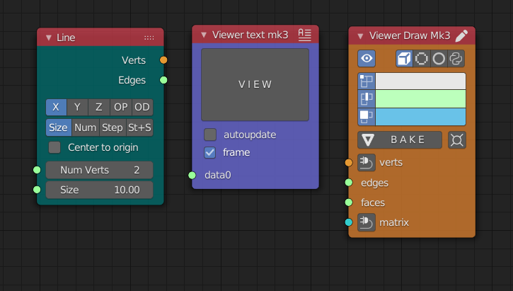
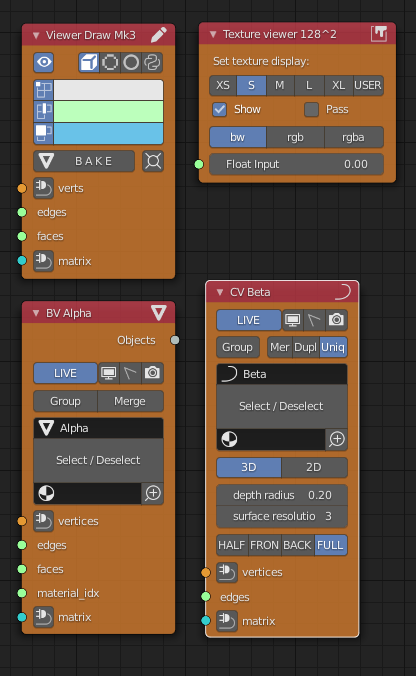
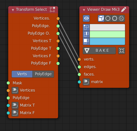 The default viewers color is almost identical to one of error colours,
and the default red on the top of the node is too similar and different generating un-confortable feelings to the eye... (imho)
The default viewers color is almost identical to one of error colours,
and the default red on the top of the node is too similar and different generating un-confortable feelings to the eye... (imho)
I propose to change it reducing the saturation to 0.5

What do you think?